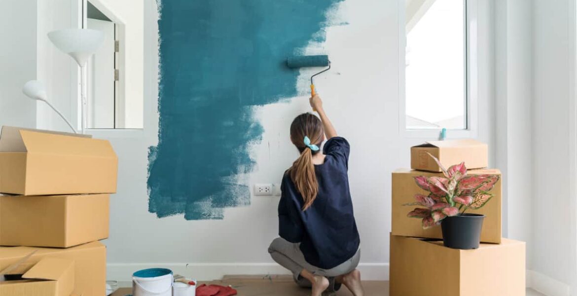
Colors play a pivotal role in interior design, setting the mood, defining the space, and reflecting personal style. Choosing the right colors can make your home feel more inviting, energizing, or serene. Here’s a guide to the best colors to use in interior design and how to integrate them into your living spaces:
White
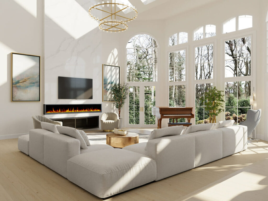
White is a staple in interior design for its versatility and ability to create a clean, open, and airy feel. It reflects light beautifully, making spaces appear larger and brighter. White pairs well with almost any color, making it an excellent base for layering textures, patterns, and accent hues.
Best For: Minimalist designs, small spaces, kitchens, and modern aesthetics.
Beige and Earthy Neutrals
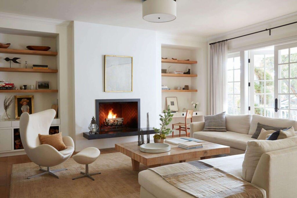
Earthy tones like beige, taupe, and greige are timeless choices that bring warmth and comfort to a space. These neutral shades work seamlessly with both modern and traditional interiors, creating a soothing and harmonious ambiance.
Best For: Living rooms, bedrooms, and spaces aiming for a cozy, inviting feel.
Soft Blues and Greens
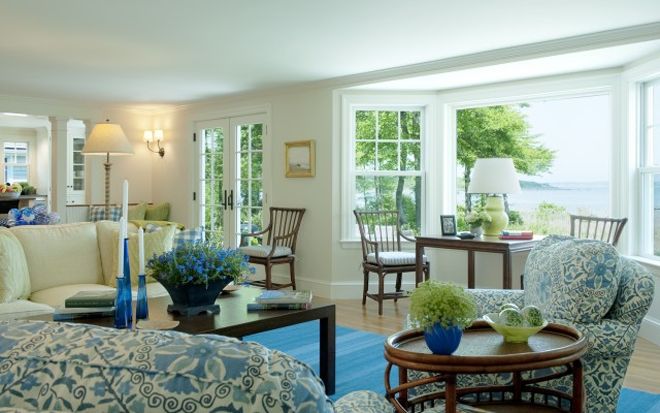
Light blues and greens evoke a sense of calm and tranquility, often reminiscent of nature. These colors are perfect for creating a serene environment and work well in spaces where relaxation is key.
Best For: Bedrooms, bathrooms, and reading nooks.
Gray
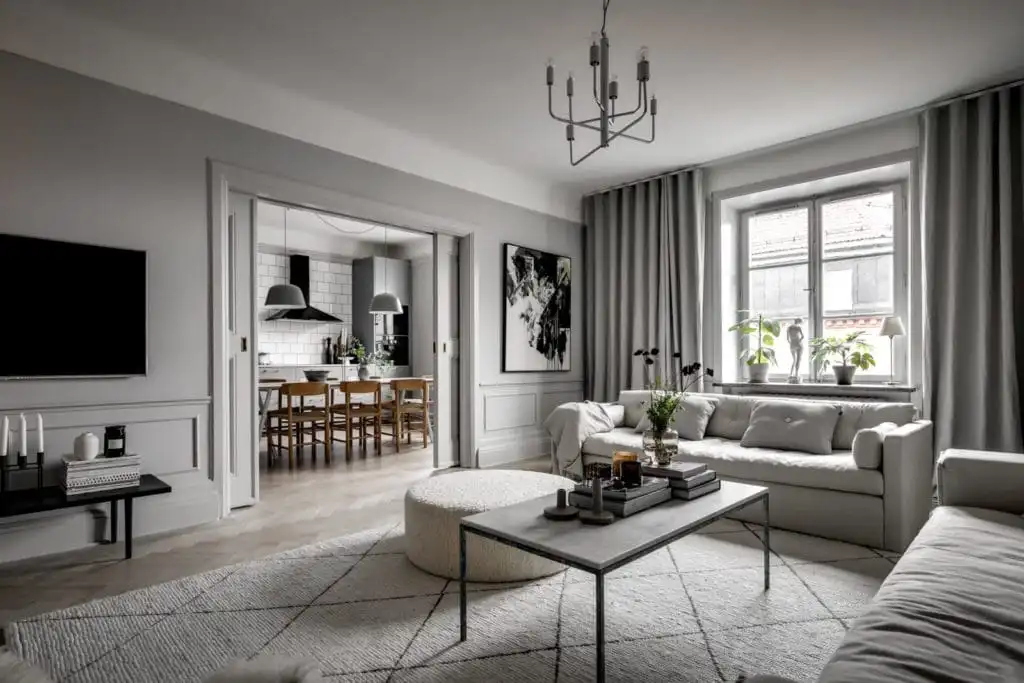
Gray is a sophisticated and versatile choice that can range from cool to warm undertones. It serves as an excellent backdrop for bold furniture or vibrant artwork, offering a contemporary vibe that suits a variety of styles.
Best For: Offices, living rooms, and modern kitchens.
Bold Jewel Tones
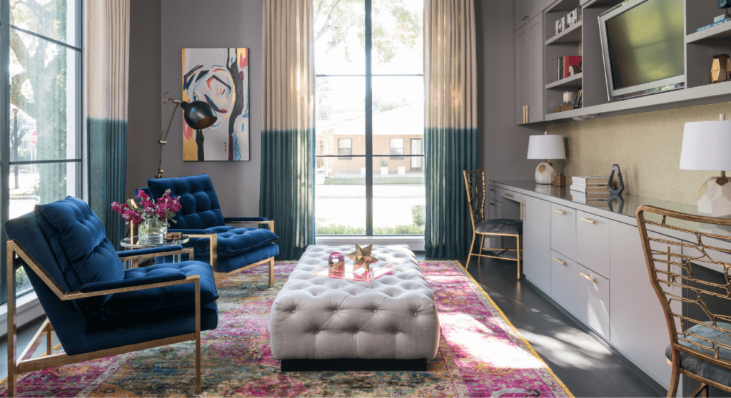
Rich jewel tones like emerald green, sapphire blue, and deep amethyst add a sense of luxury and drama to a space. These vibrant colors are perfect for creating accent walls or highlighting specific features.
Best For: Statement areas, dining rooms, or spaces that need a touch of opulence.
Warm Terracotta and Rust
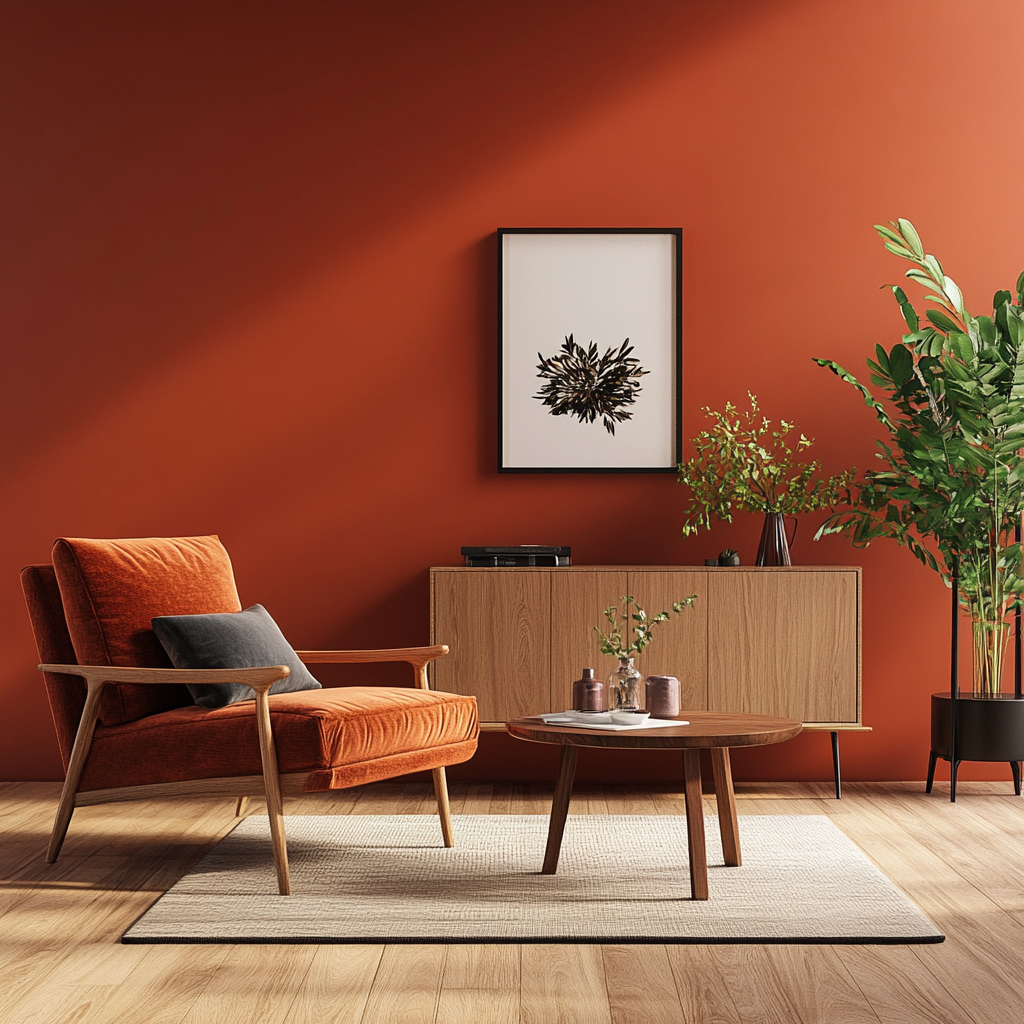
Terracotta and rust tones bring an earthy, Mediterranean vibe to interiors. These warm colors are perfect for adding character and charm, especially when paired with natural materials like wood and stone.
Best For: Kitchens, patios, and rustic-themed interiors.
Soft Pastels
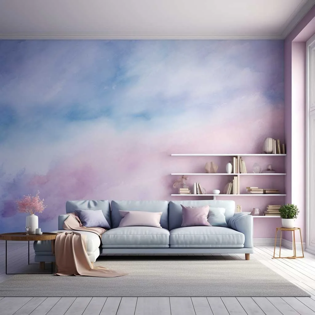
Pastel shades like blush pink, mint green, and lavender are excellent for adding a subtle pop of color without overwhelming the space. These hues are perfect for creating a playful yet sophisticated aesthetic.
Best For: Children’s rooms, kitchens, and feminine spaces.
Monochromatic Black and White
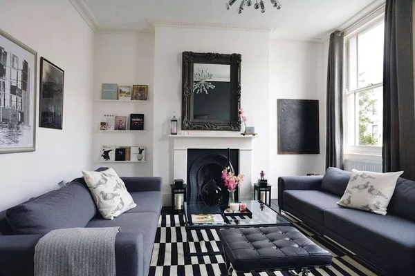
For those who love bold contrasts, black and white offer a classic and striking color scheme. This timeless combination can add depth and drama while maintaining a clean and structured aesthetic.
Best For: Bathrooms, modern kitchens, and art-inspired spaces.
How to Choose the Right Colors for Your Space
1. Consider the Room’s Purpose:
- Calm colors like blues and greens suit restful spaces.
- Energizing hues like yellow or orange are ideal for social or creative areas.
2. Assess Lighting:
Natural light enhances the true tone of colors, while artificial lighting can alter their appearance. Test swatches under different lighting conditions.
3. Use the 60-30-10 Rule:
- 60% of the space should be the dominant color (walls).
- 30% should be a secondary color (furniture/upholstery).
- 10% should be accent colors (decor/accessories).
4. Balance Bold Colors with Neutrals:
Too much of a bold hue can be overwhelming. Pair vibrant shades with neutral tones to create balance.
5. Reflect Personal Style:
Your home should feel like you. Choose colors that resonate with your personality and preferences.
[Contributed By Anushka Gaikwad]