
Knowing how to pick a well colour-coded ensemble goes a long way in personal styling! While fashion is all about celebrating your individual sensibilities, here are some colour combos that most fashionistas would advise to avoid:
Red and Purple
As far as bright colours go, red and purple are the most attention grabbing colours one might have in their wardrobe. But pairing them together more often than not leads to a fashion disaster.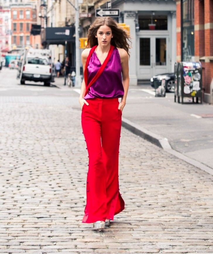
Pink and Orange
These shades are a balance between warm and cool shades. Pairing a pink top with orange bottoms or vice versa ends up with the outfit looking like an eye-sore.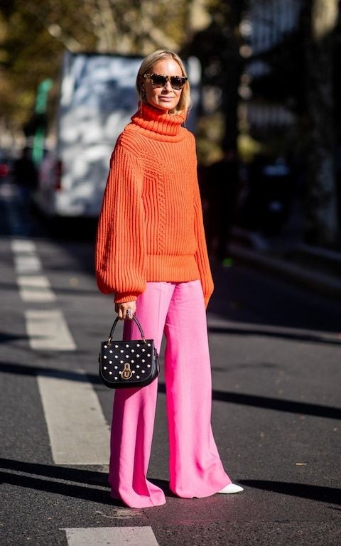
Brown and Blue
Brown being an earthy tone and blue being a cool colour makes the two clash. But if the undertones of the fabrics match you might just be able to get away with it.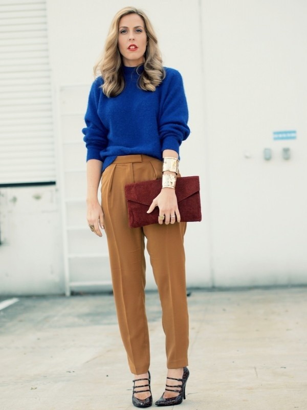
Green and Green
The colour green comes in a lot of shades and tones. When you match a green shade with undertones of yellow (warm colour) or with a green shade with undertones of blue (cool colour) they clash.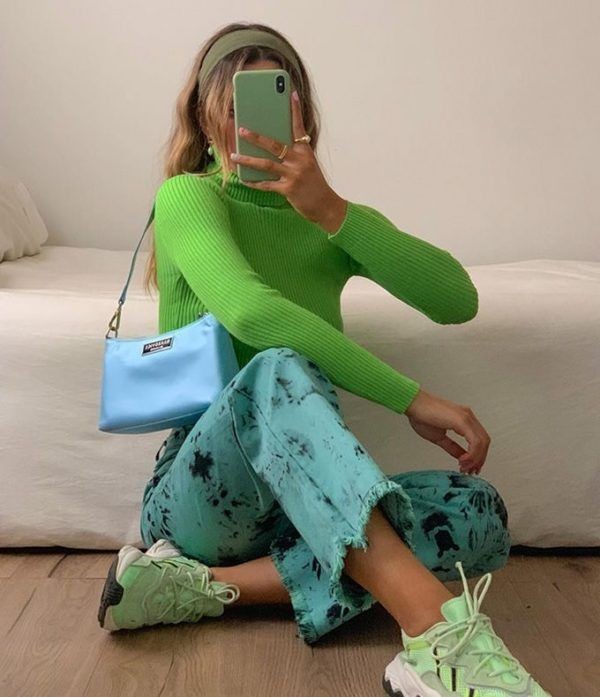
Red and Green
The unspoken rule in colour coding an outfit is, you never wear colours that are opposite to each other on the color wheel, together. Green and Red are quite literally opposite in many ways and make for a nightmare outfit when paired with each other.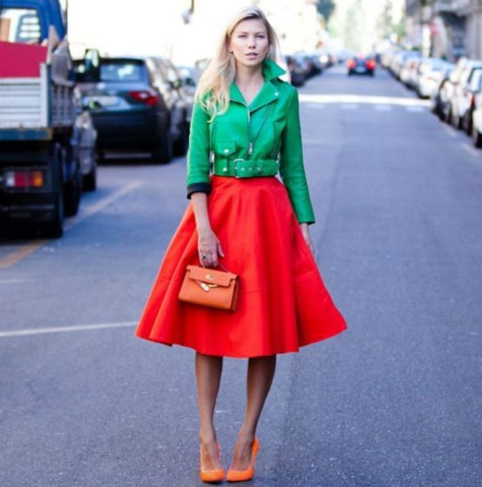
(Contributed by Prachi Mogal)